Wednesday, 8 March 2017

Evaluation Task 1 - Nine Frame Analysis

Frame 1

An extreme close-up of the 'victim' character in my trailer; Kayleigh with a blank stare as a single tear rolls down her face. Although this suggests that she is suffering from shock, rendering her unable to respond to the detective's questions (which would make her a liability), the rain in the background possibly represents the inner despair and trauma that she is trying to contain (since the raindrops on the windows somewhat resemble tears). With this in mind, it makes Kayleigh a stronger character than she was at first glance, as it shows that she's capable of not letting her emotions consume her despite the horrors she has witnessed. Rain is a common element within the thriller genre, found in films like Se7en and Shutter Island to connote a solemn/dreary mood.

- Rain in Se7en (1995)- Rain in Shutter Island (2010)

Frame 2 


A close-up of my trailer's main protagonist Detective Maria Jones. She challenges thriller conventions due to the fact that she is a middle-aged, female lead detective, when usually the detectives in thrillers are male and the women play less significant roles and are always shown to be young. The idea behind having a female lead was inspired by Girl on the Train, since it not only appeals to the female demographic but also brings a different dynamic to the thriller genre. The dynamic involves that instead of having two male leads (one older character who is wise, the other being younger and more reckless) partner up like in Se7en, we have an older female partner up with a younger male who is equally just as reckless and intelligent as herself.

- The protagonist in Girl on the Train (2016) 

Frame 3

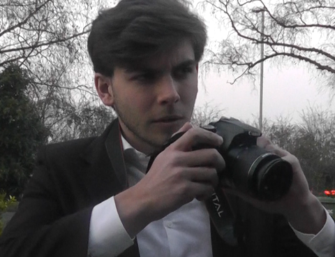
A midshot of my second lead character Peter Stone. The fact that he is not the main protagonist of the film already makes him challenge thriller conventions. Judging from his attire (E.g. wearing a white blazer/black jacket with a camera) and his curious expression, it is made clear to the audience that he is a journalist. Stone's personality and appearance was heavily inspired by Jake Gyllenhaal's journalist character Lou Bloom in Nightcrawler, who is incredibly intelligent and is very aware of it. This is both an asset and a hindrance to him as it often gets him into trouble, due to the fact that he can come across as a 'smart-alec' because of it. This trait comes into play later on in Contradiction.  

- Jake Gyllenhaal's character in Nightcrawler (2014)

Frame 4  


An over-the-shoulder shot of my two protagonists meeting face to face. At this angle Peter appears larger than Maria, which would normally infer that he is superior to her (a common stereotype in thrillers since they are usually male-dominated). However in this scene as he inquires about the recent murders that have occurred, Jones' reply is a terse "I'm not releasing any information"; demonstrating her level of authority and status over him. As she does this she is challenging the trope that women must always do what the man says.

Frame 5

An extreme close-up/zoom out of Peter Stone's crimeboard (though using Jones' old case files). This is a very common trope in thrillers since it can be used as exposition for the plot and can demonstrate a character's intelligence/determination, as it shows the amount of research they are willing to undertake in order to solve the mystery. Examples of films that have used this trope are Memento and The Silence of the Lambs.

- Memento (2000)

- The Silence of the Lambs (1991)

Frame 6


A POV shot of someone driving down a dark country road, with the headlights being the only light source. Both darkness and low-key lighting help establish the genre as thriller, because the overall concept of a thriller is to create a grim, dangerous world/atmosphere that the audience would wish to see the protagonists improve. Plus according to my research the purpose of a thriller is to "invoke a fear, anticipated or tense response from the audience", which involves playing on their fears and bringing them to life in film. By having a POV shot it is unclear of whose perspective the audience is seeing from, which creates suspense and tension as there is the chance that it is the killer's perspective (possibly on their way to their next victim).

Frame 7

A high angle shot of the next victim with the silhouette of the killer standing over them (holding a bat). High angle shots are often used to establish a character's vulnerability, which is especially evident with the girl in this scene since she is gagged/tied up and at the killer's mercy (therefore conforming to the stereotype that women are inferior to men). This scene also seems to draw parallels to Frame 4, however this time the male's (in this case the killer's) presence is more oppressive and frightening whereas in the other frame Stone's presence was merely curious. The near absence of light in this frame helps to emphasise the danger of the situation, as it seems to represent the victim's light/life being 'snuffed out'.

Frame 8 - Film Poster

For my poster I chose to use two images, one of my main characters Peter Stone as the main image and a crimeboard as the background. These two images compliment each other nicely because in my trailer there is a scene where Stone is using/looking through the old casefiles of the killer in order to come up with new leads. By using a crimeboard as a background it both hints at the film's plot (as well as clearly showing the audience what genre it is) and establishes a key character trait of Stone, which is the fact that he is very capable of performing his own research and investigation despite having never done it before. It is also a stereotype of thriller film posters to mostly feature the male character, to mostly appeal to the male audience (as for me I aim to appeal to both genders, however I figured it would be easier to win over the male demographic first since they are more familiar with the thriller genre). I made sure to add lots of shadows (using the cloud effect on Photoshop) to include the idea/concept of a 'shrouded mystery'.

Examples of thriller posters I took inspiration from:


 - Child 44 (2015)


- Absolute Power (1997)

- Taken 3 (2015)
Frame 9 - Film Magazine Cover


Ways of how my film magazine cover conforms to magazine cover stereotypes involves my decision to have one large image in the center as the main focus (which consists of one of the main leads in my film) along with three smaller images advertising other upcoming films such as She, Unstable and Ophiophobia. I chose those film titles specifically because each of them sound very vague but at the same time rather threatening and foreboding, which suits the thriller genre perfectly. Other magazine conventions/persuasive techniques I used were the mentioning of an interview with a famous director, new information on another upcoming film like Delirium and a competition which provides the audience the opportunity to win VIP tickets to a premiere. My USP is the fact that this issue is supposedly the 25th anniversary issue, which would make the audience believe that there is exclusive content within this magazine and convince them to buy it.

I chose the masterhead Legacy because it connotes that my magazine brand is timeless/legendary and that it's better than the rest.

Examples of magazine covers that I got inspiration from:


Wednesday, 1 March 2017

Evaluation Task 2 - Main Product and Ancillary Texts


Voiceover Script:

1) What common elements are in your 3 texts?

The common elements in my 3 texts are that there is a large focus on the male protagonist of my trailer, as well as the use of low key/dull lighting.

2) Which character(s) did you use to feature in your texts?

I chose to feature the male protagonist Peter Stone in order to gain the attention of the male audience. He wears a white dress shirt and black blazer to look professional which also makes him appear older than he actually is (which is early 20s).

3) Are there any relationships suggested?

There are no relationships suggested in my ancillary texts however in my trailer it is suggested that there is a rivalry and developing partnership between the two main leads.

4) Which narrative(s) did you include in my print texts?

The narrative I used in my print texts are the idea that a 'truth' being discovered (with my poster tagline being 'The truth will be found' and for my magazine cover it is 'World's most anticipated film yet?', suggesting that something major and important is going to be exposed.

5) How did these attract my audience?

This narrative attracted my audience because I created suspense and a mystery for them to want to be solved.

6) Which film genre conventions did you emphasise in your print texts?

Aside from emphasising the idea of an unsolved 'mystery' within my print texts, the other genre conventions I used were the low key lighting and use of the colour red (which is always used to connote danger or urgency).

7) Which of these (colour, fonts, themes, words) show synergy between your texts?

The colours I used (red and white) and my fonts show synergy because they are similar to one another and also show continuity between each of my texts.

8) Which effects did you use? How do they link with your film?

The effects I used for my film trailer were fade to blacks and whites and for my print texts I used altered saturations such as low brightness, drop and inners shadows and inner and outer glows. These effects link in with my film because they can all be considered as generic thriller conventions, since dull colours and shadows are very common within the thriller genre.

9) How does any institutional information (production company, certificate, schedule) link with your film?

My production company Siberian Studios links with my film because Siberian huskies are considered to be very intelligent and can be predators to small creatures. This somewhat represents the personality of my film's main character Maria Jones, because she is also very intelligent and can come across as rather intimidating to those around her.

10) Evaluate the effectiveness of your campaign

Overall I believe my campaign was fairly effective because the majority of the feedback I have received on both my trailer and my print texts have been positive.

Saturday, 18 February 2017

Evaluation Task 3 - Changes/Audience Feedback

Film Trailer

The main changes to my film trailer involve the music. Initially we had chosen the track 'Letting Go' ( https://www.youtube.com/watch?v=3MIDmPMlbcg ) to play during the scene where we show a crime scene, however over time we realised that while this type of music suited that particular scene it did not seem suitable for a thriller trailer as a whole. Because of this, we decided to replace it with the tracks 'Chaos' ( https://www.youtube.com/watch?v=rZTCRQHlGD4 ) and the first portion of 'Death Match' ( https://www.youtube.com/watch?v=FvNlvtvJdBo ).

'Chaos' has a very haunting/intimidating element to it which is appropriate for our film trailer's plot while 'Death Match' sounds very determined, which matches with our two main characters' drive to solve the case integral to the story.

After sharing my film trailer on Facebook as well as YouTube the overall feedback I received turned out to be positive. Though there were some suggestions for areas that could be improved on (E.g. improving the film quality), due to the limitations in our ability as well as equipment we are unable to do them.

Examples of feedback -


From this particular individual, they suggested that we shorten our trailer in order to reduce the risk of the audience losing focus (our trailer ended up being 2 minutes 29 seconds long). While I understand their concern (keeping the audience's attention throughout is vital with a trailer), according to my research the majority of theatrical thriller trailers are around 2 minutes long (E.g. The Girl on the Train was also 2 minutes 29 seconds long and Shutter Island was 2 minutes 23 seconds long).

Film Poster

Changes to my film poster mostly involved making the text (E.g. title and credits) central so that it would better meet film poster conventions and to change the release date (it was different to the one we had officially agreed with later on).

 Before -


After -


Before - 


After -


Plus I had originally wanted to have plain black background but then I was recommended that I change it to a crime moodboard so that it would fit with the character I put on the poster; the ambitious journalist Peter Stone.

Another suggested improvement was to rearrange the text slightly so that it would not obstruct the main image.

Before -


After - 
 

Film Magazine

As for my magazine cover I had to alter the name of a 'featured' film three times so that it not seem cheesy or boring. Eventually I settled for 'Ophiophobia' which is the phobia of snakes, which suited the image nicely.


Another change was I had to rearrange some of the text (to fill in some blank spaces) and to alter the colours so that I would have a more established colour scheme. Plus I had initially included real-life titles such as Ghost in the Shell and The Circle, therefore I had to remove them.

Before - 


After -


Evaluation Task 4 - New Media Technologies

For this project I have used a range of different new media technologies during the research, planning and editing stages of creating my film trailer. These technologies are:
  • Messenger (through phones)
  • Facebook Chat
  • Email
  • YouTube
  • Adobe Premiere Pro
  • Adobe Photoshop
Social Media

Messenger, Facebook and Email were used to communicate with the members of my group; whether it be us sending each other stuff (E.g. photos to use for our magazine covers/film posters) or scheduling filming.


YouTube

YouTube was used to get our music, which we ended up finding in the YouTube Audio Library. It was also where we watched official film trailers for inspiration and is the site where we uploaded our own trailer to when it was finished.

Adobe Premiere Pro

Adobe Premiere Pro is the program we use to edit our trailer. To use it we import clips of our film onto the program and then we proceed to drag them onto a timeline. We have the option to cut our clips to make them shorter as well as add effects/transitions onto them.


The main transitions I used for both the audio and video were the 'Exponential Fade' (which made the music fade away instead of just end abruptly), 'Cross Dissolve' (which made a video clip fade into the one after it), 'Dip to Black' and 'Dip to White' (which made a clip fade into the respective colours).
 
- Example of a Cross Dissolve
- Example of a Dip to Black
- Example of a Dip to White


The main tools I used on Premiere Pro were the Razor Tool (which allowed me to cut footage) and the Pointer Tool (which let me move footage around, extend it etc.).

Adobe Photoshop
 
Adobe Photoshop is the program I used to make my film magazine cover and film poster, the main tools I used were the lasso and smudge/blur tool. I also used a variety of different fonts and layer blending options (E.g. Overlay).